生产分析
生产分析 报告提供使用 Odoo 制造 应用程序制造的产品的统计数据。该报告有助于了解生产成本、制造工期以及有关制造产品的其他重要统计数据。
要打开生产分析报告,请导航至 。
重要
生产分析 报告是 Odoo 应用程序套件中的众多报告之一。本文档仅涵盖 生产分析 报告的特定措施,以及一些用例。
要全面了解大多数 Odoo 报表的基本功能,请参阅 报告要点 说明文档。
计量值
统计值 是指可在 生产分析 报告中选择的数据集。每个数据集代表数据库中有关 MO 的特定统计数据。点击 统计值 按钮,从下拉菜单中选择一个选项:
在 统计值 下拉菜单中显示的选项及其显示顺序,根据在 搜索… 栏中启用的筛选、分组和比较而有所不同。默认情况下,可用措施显示如下:
员工平均成本/单位 :为生产一个单位的产品而支付给员工的平均成本。
副产品总成本 :制造产品时产生的所有副产品的总价值。
组件成本/单位 :生产一个单位产品所需的组件的平均成本。
单位成本 :生产一个单位产品所需的平均成本,包括组件、员工、操作和外包成本。
每单位操作时长 :生产一个单位产品所需的平均总操作时长。
需求量 :包含在生产订单中的产品总数量。
生产数量: 产品实际生产的总单位数。
总组件成本: 在该产品的所有生产订单中,用于产品组件的总支出。
总成本 :到目前为止,生产该产品每个单位所花费的总金额。
操作总时长 :在制造该产品过程中完成的所有操作的累计时长。
总员工成本 :为制造该产品支付给员工的累计金额。
总操作成本 :生产该产品所需操作的累计花费。
每单位总操作成本 :生产一个单位产品所需操作的平均成本。
总外包成本 :为生产该产品支付给分包商的累计金额。
每单位总外包成本 :雇佣分包商生产一个单位产品的平均成本。
产出率 (%) :产品总产量与总需求量的比率,以百分比表示。
计数: 为该产品创建的生产订单总数。
小技巧
当启用了 (图表视图) 选项之一时,一次只能选择一个度量。然而,在使用 (数据透视表) 时,可以选择多个度量以及不同的分组依据(在 x 轴和 y 轴上)。
用例:比较产品
One of the best uses for the Production Analysis report is comparing statistics about two or more products. This is accomplished by entering the products into the Search… bar, then selecting the necessary measure, filter, and grouping, to see the desired data.
Example
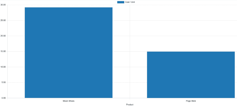
Toy manufacturer Tommy’s Toys is trying to reduce their manufacturing operation costs. To accomplish this, they have decided to identify redundant products and cease manufacturing the ones with higher operational costs.
Two of the toys that have been singled out for analysis are the pogo stick and moon shoes. Tommy’s Toys believes these two toys are so similar that they can stop manufacturing one, without significantly impacting their product offering.
To compare operation costs for the toys, business analyst Mike opens the app, and navigates to the Production Analysis page. In the Search… bar, he enters the names of both products. Then, he opens the Search… bar drop-down menu, and clicks Product in the Group By section.
Below the Search… bar, Mike clicks on the Measures drop-down menu, and selects the Total Operation Cost/Unit option. Finally, he selects the (bar chart) graph type.
With these options selected, the Production Analysis report shows a bar chart for the current year, with one bar for each product, signifying the average operation cost for one unit of the product.
With this data, Mike is able to see that the average operation cost for the moon shoes is almost twice the cost of the pogo stick. Using this insight, Tommy’s Toys decides to cease production of moon shoes, thus lowering their average cost of manufacturing operations.
Use case: compare time periods
The Production Analysis report can also be used to compare data for two different time periods. This is accomplished using the options in the Comparison section of the Search… bar.
Example
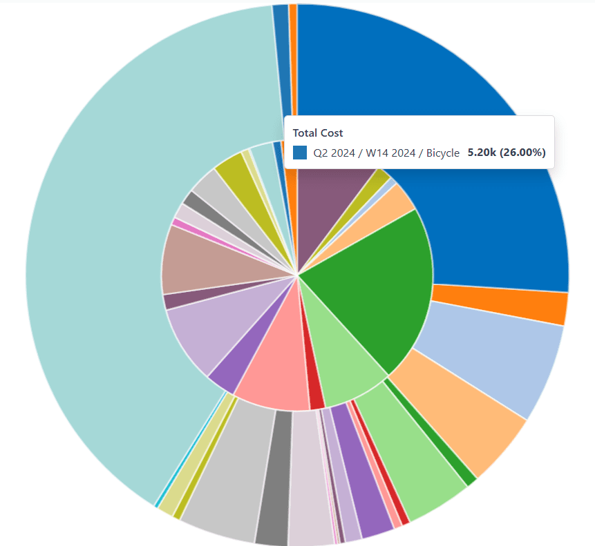
Furniture company Fanny’s Furnishings wants to compare their production costs for the first and second quarters of 2024, to see which products they spent the most money producing in each quarter.
To compare the two time periods, shop floor supervisor Adam opens the app, and navigates to the Production Analysis page. He begins by selecting the (pie chart) graph type option at the top of the page.
重要
The Comparison feature is meant to be used with the (pie chart) graph type, or the (pivot) view.
A Comparison option can still be selected with the other view types enabled, but doing so does not change the way data is displayed on the report.
Next, Adam selects the Total Cost option from the Measures drop-down menu. This option displays the total amount spent producing each product.
In the Search… bar drop-down menu, he leaves the 2024 filter enabled in the End Date section, and enables the Q2 filter as well. With both of these time periods selected, the pie chart shows data for the second quarter of 2024.
Finally, Adam selects the End Date: Previous Period option in the Comparison section of the Search… bar. Doing so causes the pie chart to be split into an inner circle, and an outer ring.
The outer ring shows data for the selected time period, quarter two of 2024. The inner circle shows data for the previous time period, quarter one of 2024.
注解
If End Date: Previous Year is selected instead of End Date: Previous Period, the inner circle shows data for the selected time period, one year previous.
In the case of this example, it would show data for quarter two of 2023.
Using this report, Adam can see that the products with the highest total cost for quarter two are the bicycle and tricycle. On the other hand, in quarter one, the roller skates had the highest total cost.