字段和小组件
字段构成数据库的模型。如果将模型描绘为表格或电子表格,则字段就是记录中存储数据的列(或行)。字段还定义了其存储的数据的类型。数据在 UI(用户界面) 上的显示方式和格式由小组件定义。
从技术角度看,Odoo有15种字段类型。您也可以在Studio的20种字段中进行选择,因为某些字段类型可以多次使用不同的默认小组件。
简单字段
简单字段包含基本值,如文本、数字、文件等。
Note
Non-default widgets, when available, are presented as bullet points or sub-headings below.
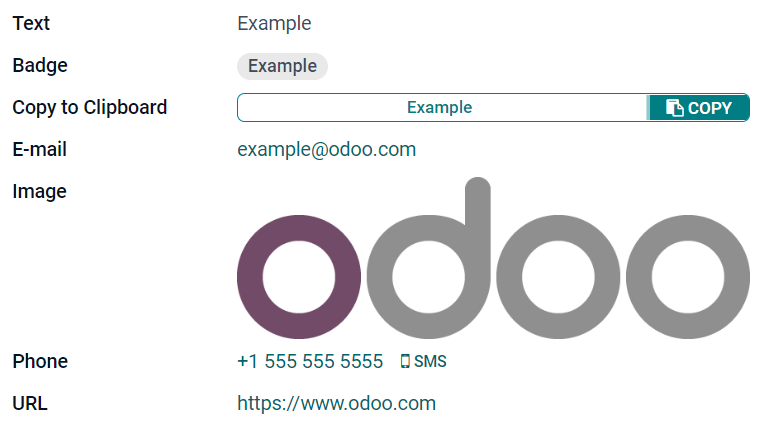
文件 (char)
:guilable:`文本` 字段用于包含任何字符的短文本。填写该字段时显示一行文本。
:guilable:`标记`: 显示圈内值,类似于标记。该值不能在用户界面上编辑,但可以设置默认值。
复制到剪贴板: 用户可以点击按钮复制值。
电子邮件: 该值变为可点击的*电子邮件*链接。
图片: 使用URL显示图片。该值不能手动编辑,但可以设置默认值。
Note
This works differently than selecting the Image field directly, as the image is not stored in Odoo when using a Text field with the Image widget. For example, it can be useful if you want to save disk space.
电话: 该值变为可点击的 电话 链接。
Tip
勾选 启用短信 ,可直接从该号码字段旁的图标用Odoo发送短信。
URL: 该值变为可点击的URL。
Example
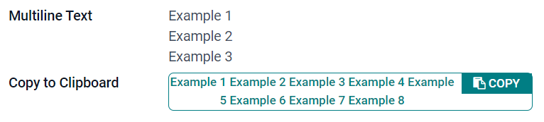
多行文本 (text)
:guilable:`多行文本` 字段用于包含任何类型字符的较长文本。填写该字段时,用户界面上显示两行文本。
复制到剪贴板: 用户可以点击按钮复制值。
Example
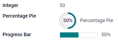
整数 (integer)
:guilable:`整数` 字段用于所有整数 (:dfn:`正数,负数,零, 等没有小数点的数字。
:guilable:`百分比饼图`: 显示百分比饼图值,通常为计算得出的值。该值无法在用户界面上编辑,但可以设置默认值。
进度条: 显示百分比条旁的值,通常为计算得出的值。该字段无法手动编辑,但可以设置默认值。
Handle排序: 显示拖动手柄图标,用于在 List view 中手动排序记录。
Example
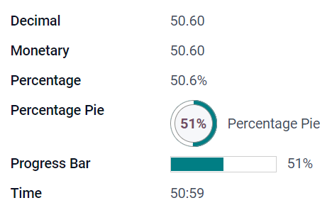
小数 (float)
小数 字段用于所有小数 (正小数,负小数, 零, 需要小数点的数字)。
Note
小数在用户界面上显示为两位小数,保存在数据库中时精度更高。
Monetary: it is similar to using the Monetary field. It is recommended to use the latter as it offers more functionalities.
百分比: 在数值后显示百分比符号。
:guilable:`百分比饼图`: 显示百分比饼图值,通常为计算得出的值。该字段无法手动编辑,但可以设置默认值。
进度条: 显示百分比条旁的值,通常为计算得出的值。该字段无法手动编辑,但可以设置默认值。
时间: 数值须为 小时:分钟 格式,最大分钟值为59。
Example
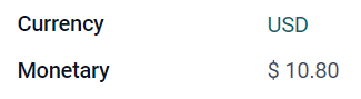
货币 (monetary)
货币 字段用于所有货币值。
Note
首次添加 :guilable:`货币` 字段时,如果模型上不存在 币种 字段,则会提示添加 :gullable:`币种` 字段。Odoo为您添加 :guilable:`币种` 字段。添加完成后,应再次添加 :guilable:`货币` 字段。
Example
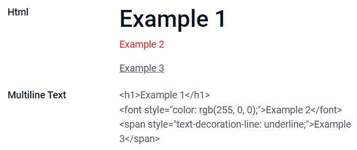
超文本标记语言 (html)
超文本标记语言 字段用于添加可使用Odoo HTML编辑器编辑的文本。
多行文本: 禁用Odoo HTML编辑器,以便允许编辑原超文本标记语言。
Example
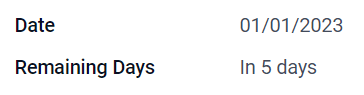
日期 (date)
日期 字段用于从日历选择日期。
Remaining Days: the remaining number of days before the selected date is displayed (e.g., In 5 days), based on the current date. This field should be set to Read only.
Example
日期和时间 (datetime)
日期和时间 字段用于从日历选择日期,从钟表选择时间。如果未设置时间,则自动采用用户的当前时间。
Tip
As well as general properties, some specific properties are available for Date & Time fields that have the Date & Time or Date Range widget set.
Date Range (daterange)
The Date Range widget is used to display a period of time defined by a start date and an end date in a single line. A date range can have a mandatory start and end date, e.g., for a multi-day event, or allow an optional start or end date, e.g., for a field service intervention or a project task.
Adding a date range requires two fields: a Date & Time field with the Date Range widget set and another field that is selected as the start date or end date. This underlying field can be an existing Date or Date & Time field, or one created specifically for this purpose.
To add a date range:
Identify an existing Date or Date & Time field that can be used as the underlying start/end date field, or add a new one. If the date range:
has a mandatory start date and end date, this field can be either the start date or end date; the outcome is the same.
allows an optional start or end date, this field is the start date or end date, respectively.
Tip
To avoid displaying the same information twice, the underlying start/end date field can be made invisible by enabling Invisible or removed from the view by clicking Remove from view.
Add a Date & Time field and set the Widget field to Date Range.
Enter an appropriate Label.
Select the underlying start/end date field from the Start date field or End date field dropdown, as relevant.
If the date range should have a mandatory start and end date, enable Always range.
Update any other general properties or specific properties for Date & Time fields as needed, then click Close in the upper right corner of the screen.
Example
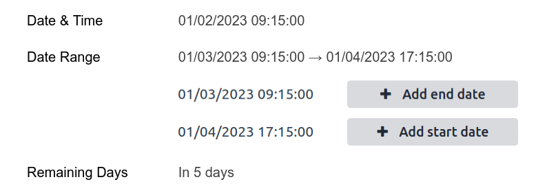
Remaining Days (remaining_days)
The Remaining Days widget displays the remaining number of days before the selected date (e.g., In 5 days), based on the current date and time. This field should be set to Read only.
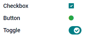
复选框 (boolean)
复选框 字段用于值只能为是或否时,选中或取消选中复选框,以进行指示。
按钮: 显示为单选按钮。该小组件可在不切换至编辑模式的情况下工作。
切换: 显示为切换按钮。该小组件可在不切换至编辑模式的情况下工作。
Example
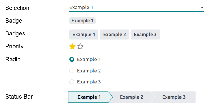
选择 (selection)
选择 字段用于用户从一组预定义值中选择一个值。
:guilable:`标记`: 显示圈内值,类似于标记。该值不能在用户界面上编辑,但可以设置默认值。
多个标记: 在水平排列的矩形内同时显示所有可选值。
Priority: displays star symbols instead of values, which can be used to indicate an importance or satisfaction level, for example. This has the same effect as selecting the Priority field, although, for the latter, four priority values are already predefined.
单选: 同时显示所有可选值的单选按钮。
Tip
By default, radio buttons are organized vertically. Enable Display horizontally to switch the way they are displayed.
Status Bar: displays all selectable values at the same time as an arrow progress bar.
Tip
By default, values on the status bar are selectable. Disable Clickable to prevent the value being edited on the UI.
Example
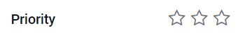
优先级 (selection)
The Priority field is used to display a three-star rating system, which can be used to indicate importance or satisfaction level. This field type is a Selection field with the Priority widget selected by default and four priority values predefined. Consequently, the Badge, Badges, Radio, and Selection widgets have the same effects as described under Selection.
Tip
要通过添加或删除值来更改可用星的数量,点击 :guilable:`编辑值` 。请注意,第一个值等于0星(即未作选择),因此,三星评级系统具有4个值。
Example
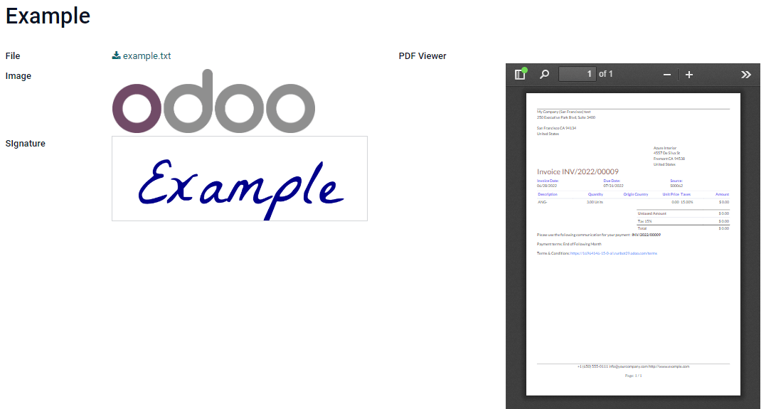
文件 (binary)
文件 字段用于上传任何类型的文件,或 签署表单 (:guilabel:`电子签名`小组件)。
Image: users can upload an image file, which is then displayed in Form view. This has the same effect as using the Image field.
PDF查看器 : 用户可以上传PDF文件,上传后,可以在 表单视图 中查看该文件。
Sign: users can electronically sign the form. This has the same effect as selecting the Sign field.
Example
图片 (binary)
The Image field is used to upload an image and display it in Form view. This field type is a File field with the Image widget selected by default. Consequently, the File, PDF Viewer, and Sign widgets have the same effects as described under File.
Tip
要更改上传图片的显示大小,在 :guilable:`尺寸` 选项下选择 小 、 :guilale:`中` 或 :guilalb:`大` 。
签署 (binary)
The Sign field is used to sign the form electronically. This field type is a File field with the Sign widget selected by default. Consequently, the File, Image, and PDF Viewer widgets have the same effects as described under File.
Tip
To give users the Auto option when having to draw their signature, select one of the available Auto-complete with fields (Text, Many2One, and Related Field on the model only). The signature is automatically generated using the data from the selected field.
关系字段
关系字段用于链接并显示另一模型中记录的数据。
Note
非默认小组件(如可用)显示为以下项目符号。
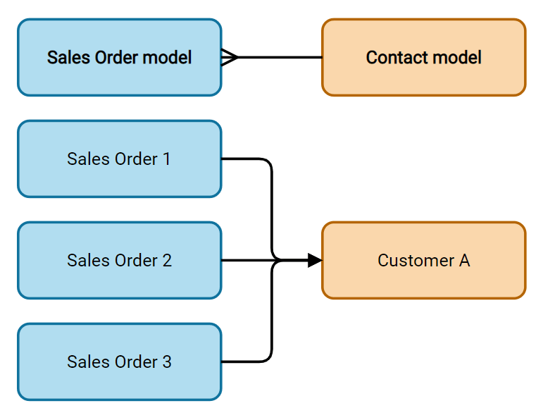
Many2One (many2one)
Many2One 字段用于将另一记录(来自另一模型)链接至正在编辑的记录。来自另一模型的记录名称将显示在正在编辑的记录中。
Tip
要防止用户在链接的模型中创建新记录,勾选:guilable:
禁用创建。要防止用户在弹窗中打开记录,勾选 :guilable:`禁用打开` 。
要帮助用户只选择正确的记录,点击 :guilable:`域` ,创建筛选器。
标记 : 显示圈内值,类似于标记。该值不能在用户界面上编辑。
单选: 同时显示所有可选值的单选按钮。
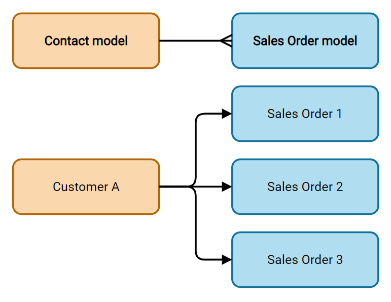
One2Many (one2many)
One2Many 字段用于显示当前模型中的记录和另一模型中的多个记录间的现有关系。
Note
To use a One2Many field, the two models must have been linked already using a Many2One field. One2Many relations do not exist independently: a reverse-search of existing Many2One relations is performed.
多行 (one2many)
多行 字段用于创建有多行和多列的表格(例如,销售订单中的多个产品行)。
Tip
要修改列,点击 :guilable:`多行` 字段,然后点击 :gullable:`编辑列表视图` 。要编辑用户点击 :guilable:`添加明细` 时弹出的表单,改为点击 :gullable:`编辑表单视图` 。
Example
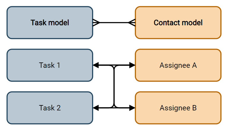
多对多Many2Many (many2many)
The Many2Many field is used to link multiple records from another model to multiple records on the current model. Many2Many fields can use Disable creation, Disable opening, Domain, just like Many2One fields.
多个复选框 : 用户可以通过多个复选框选择多个值。
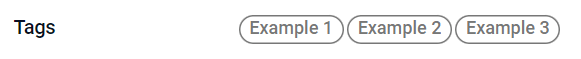
Tags: users can select several values appearing in rounded shapes, also known as tags. This has the same effect as selecting the Tags field.
标签 (many2many)
The Tags field is used to display several values from another model appearing in rounded shapes, also known as tags. This field type is a Many2Many field with the Tags widget selected by default. Consequently, the Checkboxes and Many2Many widgets have the same effects as described under Many2Many.
Tip
要显示具有不同背景颜色的标记,勾选 :guilable:`使用颜色` 。
Example
属性
General properties
Invisible: Enable this property when it is not necessary for users to view a field on the UI. This helps declutter the UI by only showing the essential fields depending on a specific situation.
The Invisible attribute also applies inside Studio. To view hidden fields in Studio, click on a view’s View tab and enable Show Invisible Elements.
Required: Enable this property if a field should always be completed by the user before being able to proceed.
Readonly: Enable this property if users should not be able to modify a field.
Note
You can choose to enable Invisible, Required and Readonly for specific records only by clicking on Conditional and creating a filter.
Example
在 联系人 模型的 表单 视图中, 职务 字段仅在选择 个人 时显示。因为该字段对 公司 联系人无用。
Label: the field’s name on the UI. This is not the name used in the PostgreSQL database. To view and change the latter, activate the developer mode and edit the Technical Name.
Help Tooltip: To explain the purpose of a field, add a description. The text is displayed inside a tooltip box when hovering with your mouse over the question mark beside the field’s label.
小组件 : 要更改某字段的默认外观或功能,选择可用小组件中的一个。
Placeholder: To provide an example of how a field should be completed, add placeholder text. The text appears in light gray until a value is entered.
Default value: To display a default value in a field when a record is created, add a value.
Allow visibility to groups: To limit which users can view the field, select one or more user access groups.
Forbid visibility to groups: To prevent certain users from seeing the field, select one or more user access groups.
Properties for Date & Time fields
For Date & Time fields that have the Date & Time or Date Range widget set, some specific properties are available:
Minimal precision: Determine the smallest date unit that must be selected in the date selector. The possible values are Day, Month, Year or Decade. If no value is selected, the user must select a day in the date selector.
Maximal precision: Determine the largest date unit that can be used to navigate the date selector. The possible values are Day, Month, Year or Decade. If no value is selected, the user can navigate the date selector by decade.
Warning for future dates: Enable this property to display a warning icon if a future date is selected.
Condensed display: Enable this property to show days, months and hours with no leading zeros, e.g.,
4/2/2025 8:05:00instead of04/02/2025 08:05:00.Show time: This property is enabled by default for Date & Time fields. On a read-only field, disable the property to show only the date. This can keep a list view less cluttered, for example.
Show seconds: This property is enabled by default for Date & Time fields. Disable the property to show only hours and minutes.
Time interval: Enter a value to determine the minute intervals shown in the time selector. For example, enter 15 to allow quarter-hour intervals. The default value is set to 5 minutes.
Earliest accepted date: Enter the earliest date that can be selected in the date selector in ISO-format, i.e.,
YYYY-MM-DD. If the current date is always the earliest accepted date, entertoday. On the date selector, dates prior to the earliest accepted date are grayed out.Latest accepted date: Enter the latest date that can be selected in the date selector in ISO-format, i.e.,
YYYY-MM-DD. If the current date is always the latest accepted date, entertoday. On the date selector, dates later than the latest accepted date are grayed out.